crash course 6: post-processing and printing
Of all the modules I’ve produced for this “course”, this started out as the hardest.
It’s simply not possible to condense a post processing tutorial into a snappy blog post. There are just too many variables from the type of software to the look you would personally prefer.
When I got to about 10 pages of information, I reckoned that was way too much and you’d be far better off watching a video or reading a book than my attempt in a blog post.
So, I rubbed it all out and started over again.
Anyway, it’s here that I would give you what I consider the best, most important advice. That is to find a look you like, remember or write down how you did it and apply it to all your images to make them consistent and your own.
I’ll share with you here what I do to my landscape images to get what I think is my look, but you may not like what I do and how my images turn out. It really is a very subjective, and emotive, issue.
Anyway, regarding the processing of my images (I always shoot my images in "raw" format by the way – see the previous post on exposure) I use Adobe Lightroom and Photoshop along with a program called Capture One which is excellent at handling my Fuji X-T3 files.
 |
| a raw image straight out of my Fujifilm X-T3 |
I also calibrate my monitors every couple of weeks to make sure the colours are accurate and brightness levels are spot on too. A badly calibrated monitor can result in horrendous prints, and images looking totally different on a different monitor or your phone.
After importing an image into Lightroom, I generally work logically through the tools, one by one. Well, the tools I use that is, as I don’t employ them all. This is my normal workflow:
- crop and straighten any wonky horizons. No matter how careful you are at levelling your camera, there’s always the chance a horizon might not be 100% accurate. Also, cropping is essential to show your image as best you can. I tend to stick to 1x1, 4x5, 16x9, 16x10 and 17x6 (for panoramas).
- remove anything from my image using the heal and clone tool.
- apply any graduated or radial filters necessary to enhance the image or add contrast to draw the eye into the scene or to emphasise a part of it.
- warm up or cool down the white balance to my taste. I usually go for a slightly warm look in my images, to give them a nice, erm warm feel. It’s more homely if you ask me.
- fiddle about with texture, clarity, contrast and the dehaze tool to taste.
- add some vibrance and take away some saturation globally, then tweak hue and saturation in the different individual colour channels. Take care not to over saturate things though, as this can make your image look a bit silly and unreal. Although if you like this look, fill your boots!
- apply some sharpening, although the images from my cameras are generally sharp enough, and in some instances needing some softening to make them look nicer and more natural.
I then open the image in Photoshop and deal with any spot healing to remove unwanted things from my image. I pay particular attention to what I call “border patrol”. That is a careful examination of the image’s edges to remove anything distracting. I also use Photoshop for image blending and focus stacking, but probably use less than .0005% of Photoshop’s full potential!
I then save or export the finished image to my desired location.
I put some of my images on my Instagram and 500px pages online, and for that extra special image I print it.
 |
| the processed image |
To sum up, I really try not to do too much to my images. This begins in the field by getting as much right “in camera” as I can and ends with re-touching them as gently and sympathetically as possible. Generally, I can process an image to my taste in around 3-5 minutes from start to finish.
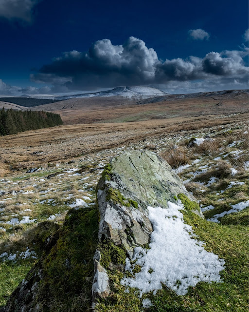
Taking the above image as an example, this was my workflow (note it took less than 2 minutes from start to finish):
- image imported to Lightroom
- cropped to 8x10 and positioned in frame
- graduated filter applied to sky (-2 exposure, +50 clarity, +35 dehaze) to bring out more detail and texture to the clouds
- white balance set to 4,693 to cool the image down a little
- global contrast set to +10 and vibrance set to +25
- orange colour channel saturation set to +70 and blue desaturated to -40
- image transferred to Photoshop
- loose twigs in foreground removed
- image resized to 2000x2500 pixels and exported as a jpeg for this blog.
When it comes to printing, I take great care to ensure the print looks like it does on the screen. I’ve already stated that I regularly calibrate my monitors, and I also make sure to download and use the correct paper profile for the paper I’m using.
To do this, I use the print module in Lightroom, as it affords a great deal of control over the finished print.
I tend to stick to Canon papers in my Canon printer though, and always use Canon’s proprietary ink after some disastrous results with cheaper third-party inks.
To ensure no fingerprints, I use white cotton gloves to handle my papers when feeding them into and removing them from the printer.
Finally, for those extra special images that I want to print big and hang on my wall or someone wants to buy one larger than I can print at home, I use a photo printing company to produce them for me. This gives me a much larger choice of papers and finishes. But this is where having an accurately calibrated monitor is especially important. Having your image come back looking totally different to what you thought it would be is devastating.
Believe me.
.......................................................
And there you have it. Follow these simple steps and you’ll be processing your images like a master in no time!
Seriously, image editing software is a minefield, with steep and protracted learning curves and plenty of frustration along the way and I don’t profess to know more than a tiny proportion of what my own software is capable of. I haven't even touched on blending images, focus stacking or using layers in Photoshop as it would simply get far too complex.
But as I already said, the most important thing is to create your own style and look – from shooting images in the field right through to publishing them on the web or printing them to sell or hang on your wall. Do you want your images to be bright and vivid, or subtle and washed out? It’s up to you.
 |
| I think this image has my "look" |
Thanks for sticking to the end. Remember, with your photography whatever genre you prefer to shoot) don't just document what's in front of you. I hate the phrase "tell a story", but try to convey atmosphere and emotion in your work and you won't go far wrong.
Anyway, I hope you’ve enjoyed this short course and that it’s inspired you to be more creative with your camera and create your own “look”. Either that or it’s bored you to tears or you’ve avoided the past few posts because of that.
Don’t worry. I understand!
It’s simply not possible to condense a post processing tutorial into a snappy blog post.

Has ANYONE learned all the in and outs of Photoshop? I don't think even the people who developed Photoshop know all the bells and whistles! LOL ;)
ReplyDeleteThis wasn't boring at all...it would be even more impactful if you could produce a couple of accompanying videos to enhance this essay. (Hunt hint)
ReplyDelete